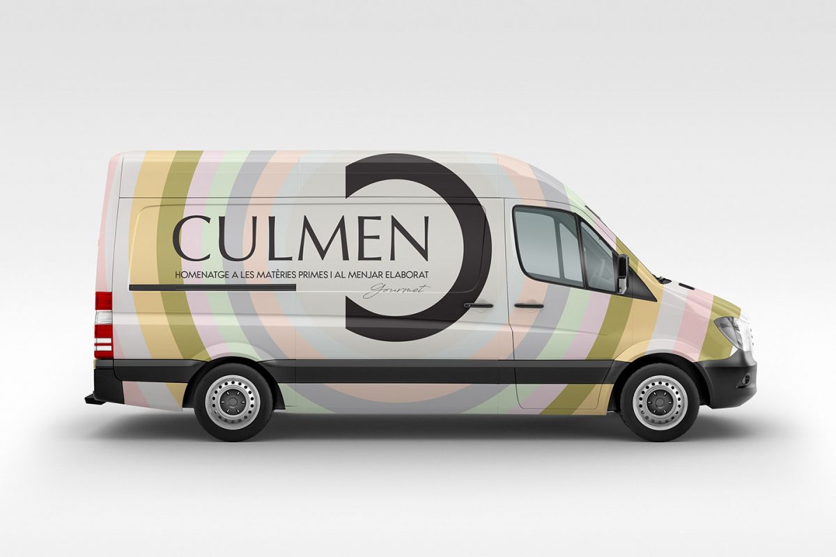
NAMING, BRANDING & PACKAGING
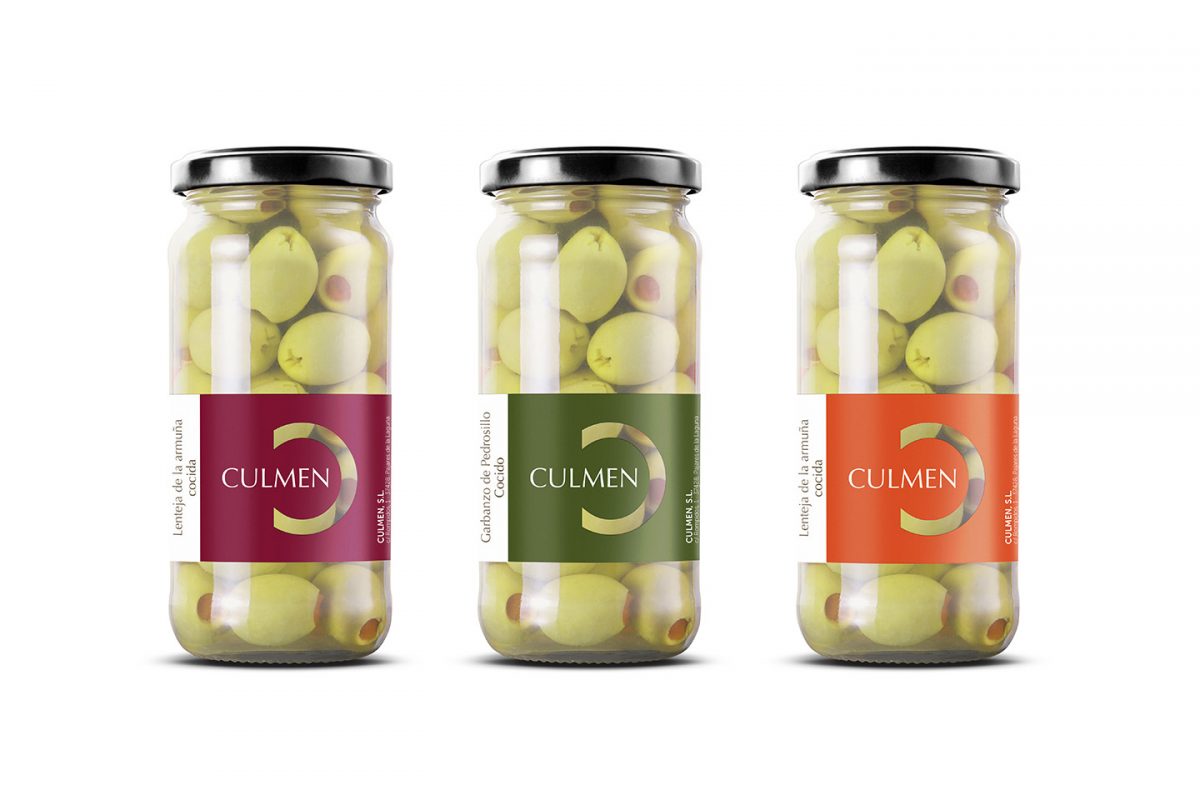
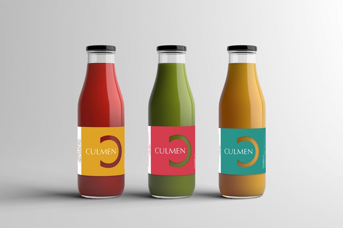
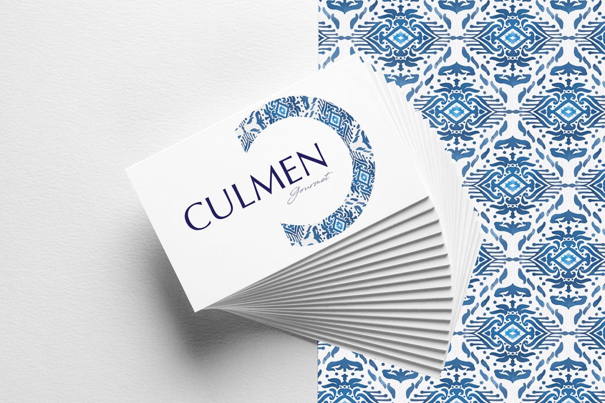
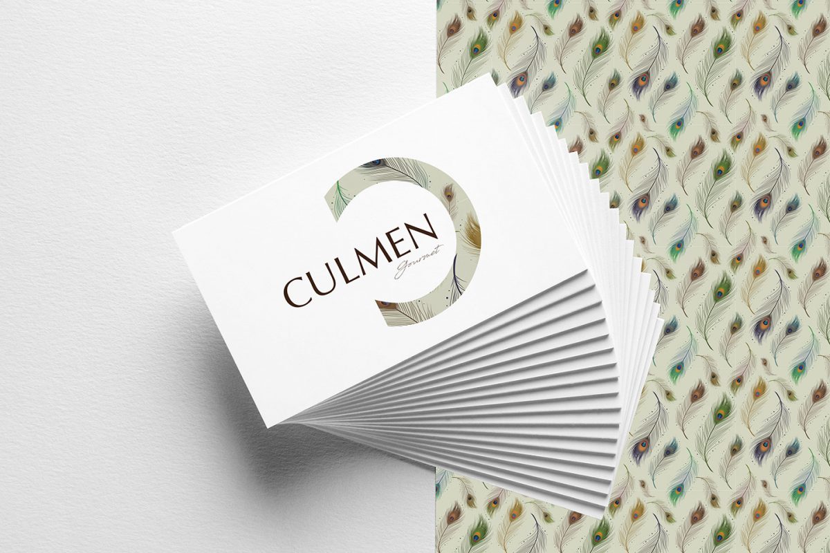
Naming, branding and #identidadcorporativa project, a packaged food distribution company. To develop their identity, we focused on three values: proximity, family business and quality. The #naming CULMEN comes with the parallelism of the definition itself: the highest point in the trajectory of a thing or the maximum degree of its evolution. This name refers to the highest quality of the products and the welcoming tastes of home, since they are products of the land.
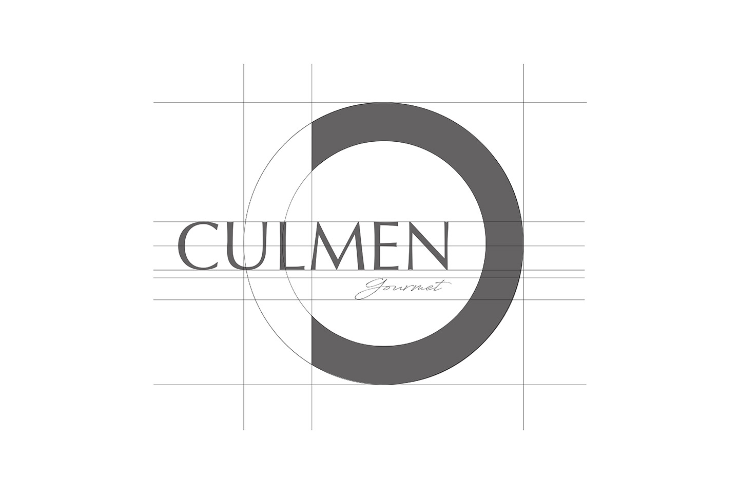
LOGOTIP
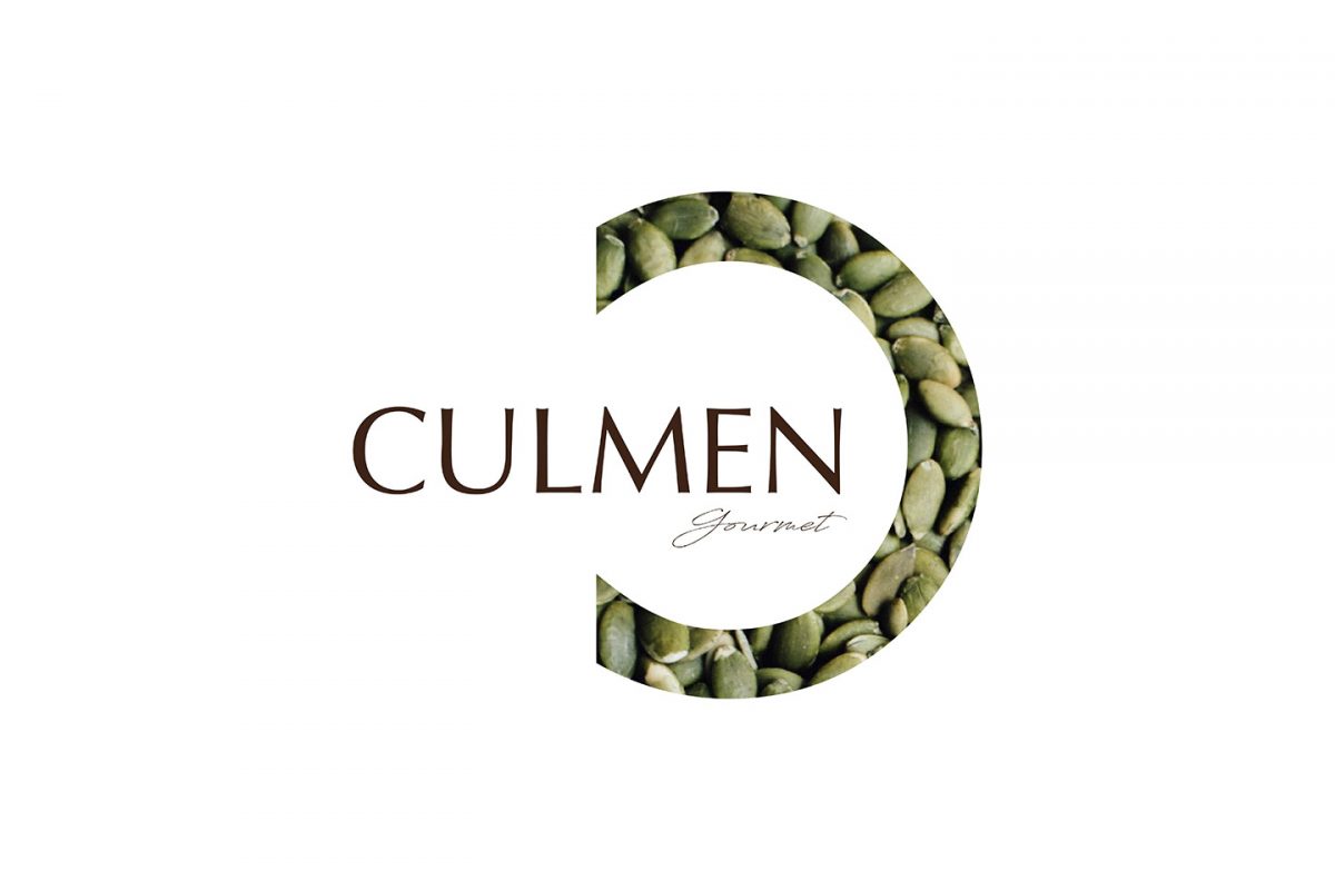
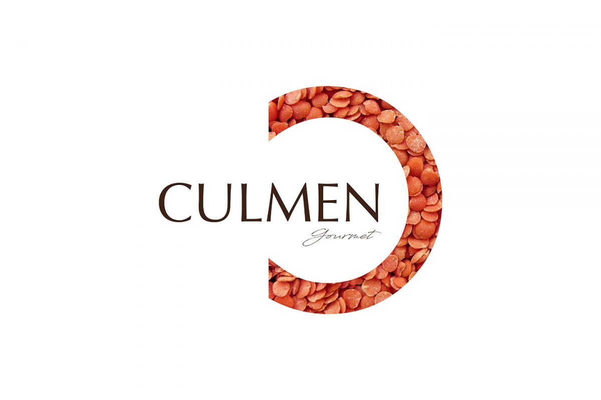
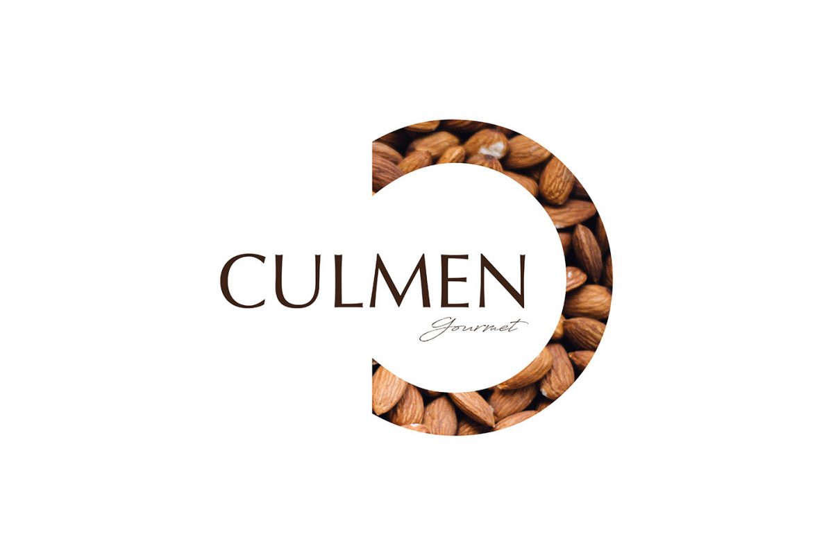
By designing the #logo of the CULMEN brand we linked the image of the voluminous letter ‘C’, creating its custom identity. The typography used presents romantic details that reinforce the elegance and notoriety of the brand. For the #baseline we have used a #handwriting typography to defend the quality and craftsman product.
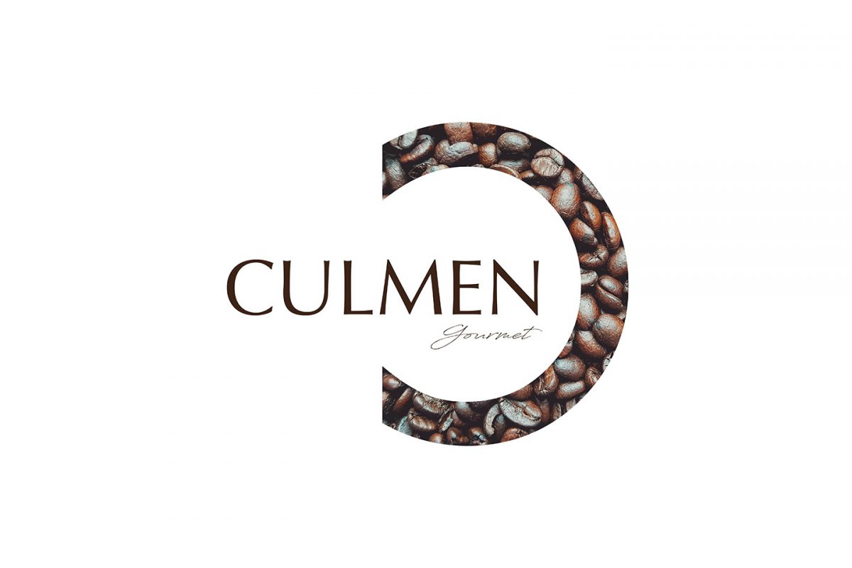
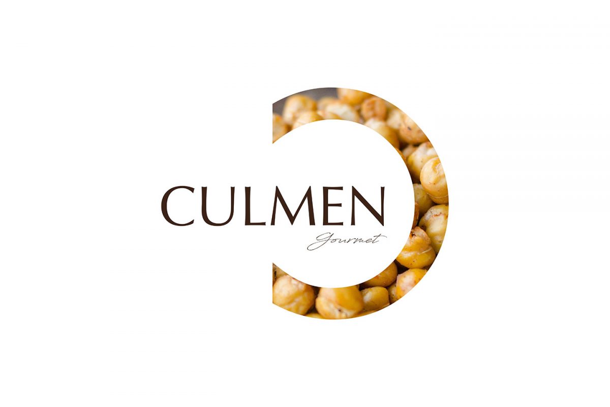
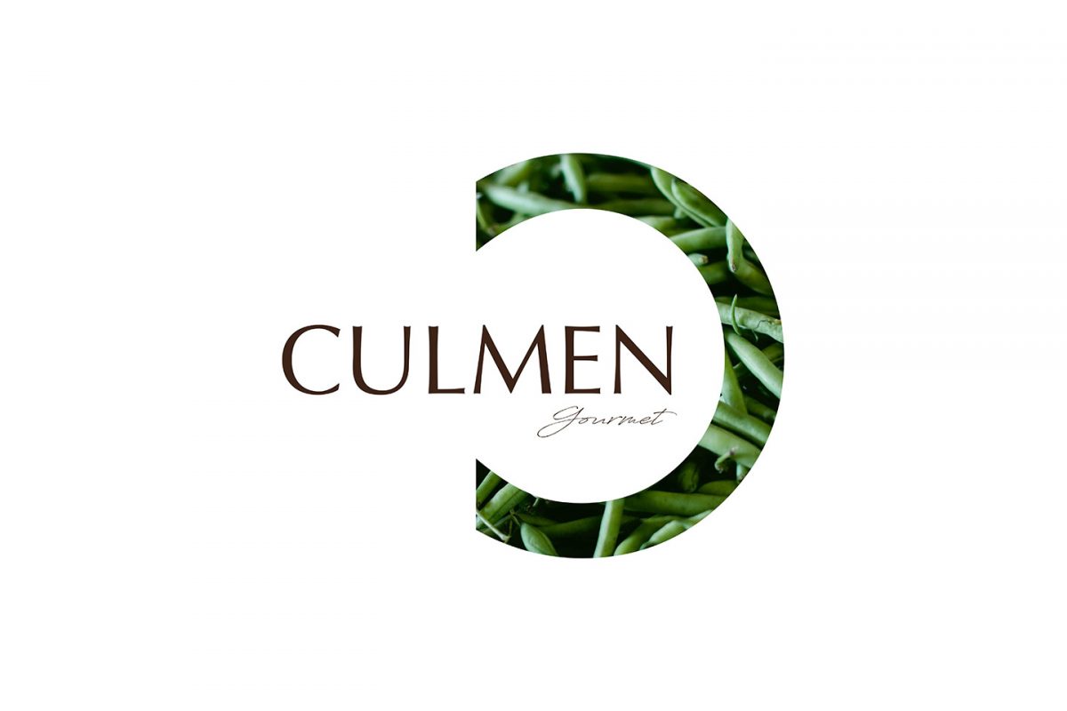
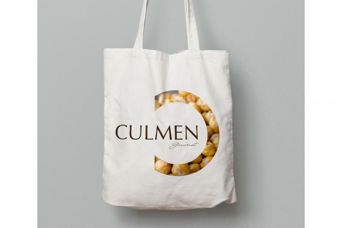
This #logo allows us to fill the working space with elegant textures and products, classifying them by categories. We are very proud of the result? and hope that you are convinced that we will be able to show you great design for the #packaging and the #labelling of your products! ??
Back to portfolio


 Exclusive member of