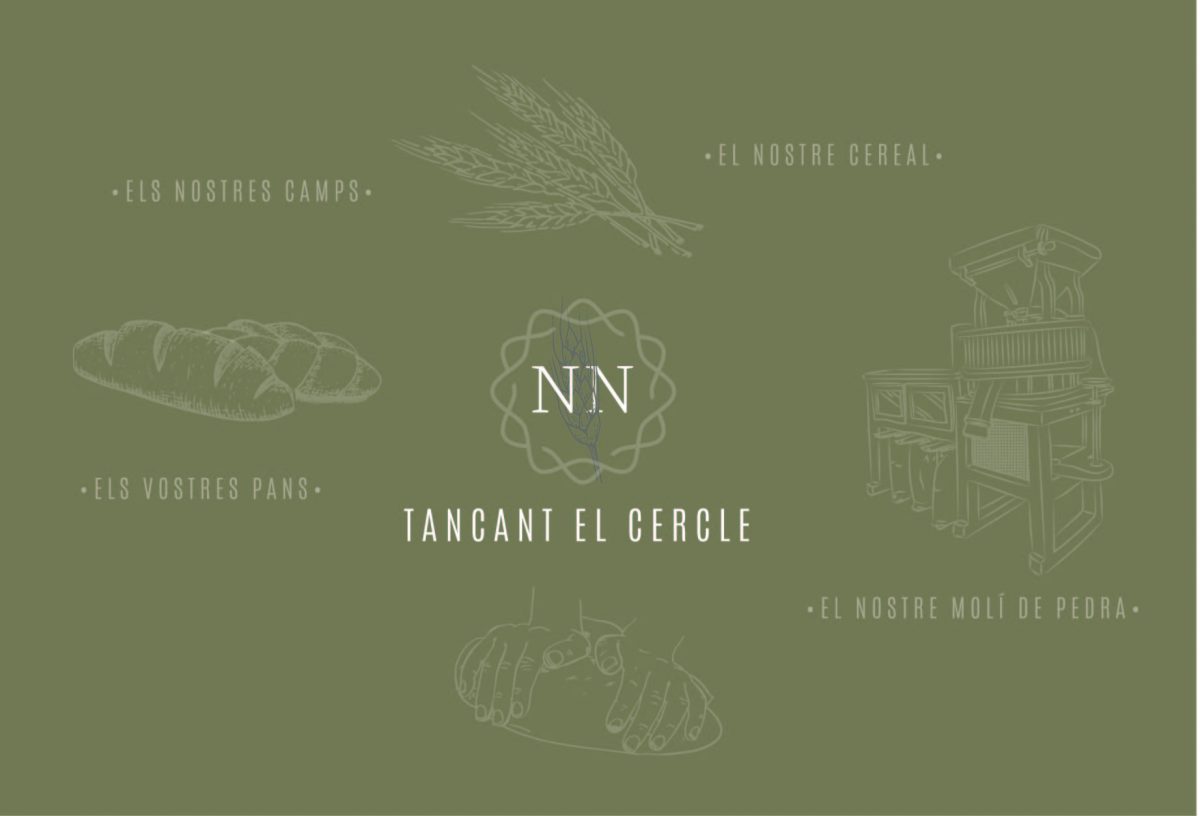
TANCANT EL CERCLE
Today we present the corporate image of Forn Noé, a brand that makes a bread where they control the whole process to close the circle — own mill, own fields, own workman. With this concept in mind, we create the campaign “CLOSE THE CIRCLE’. ( As an agency, we recognized that this is equivalent to looking for the most authentic taste and personality for each image for our clients.)
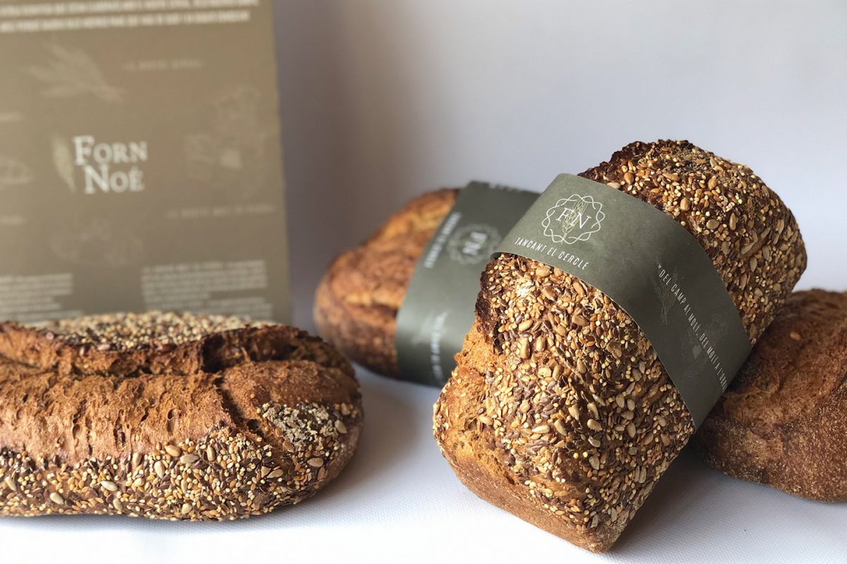
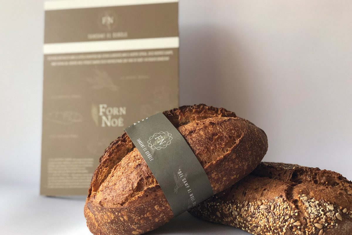
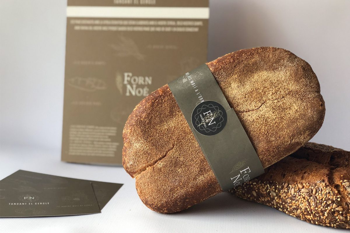
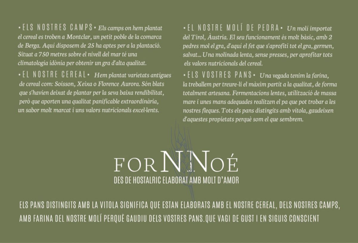
Labeling their breads then followed the evolving concept of “vitality” where the whole process is explained. The colors used coincide with the colors of the earth.
The best advertising is the product and the Marlon Branding team can attest, but for the timid or unsure, we have developed DISPLAYS with recycled paper presenting the special characteristics. And we have accompanied those with INFORMATIVE BANNERS made from recycled paper, aware of the importance of taking care of the environment and the land.
The process of making bread is very similar to the conceptualization process of a brand. Till the field and sow the best wheat is equivalent to looking for the best elements (colors, typography, leading, interludes…). Grinding the wheat to make the best flour possible, and kneading is equal to seeking to optimize all possibilities to create a strong brand, with notoriety and staying power.
Thank you for counting on us!
Back to portfolio


 Exclusive member of