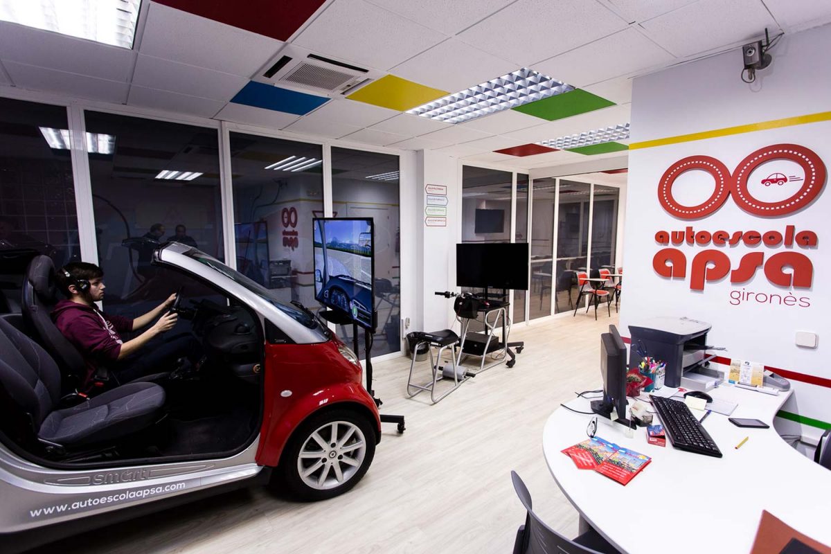
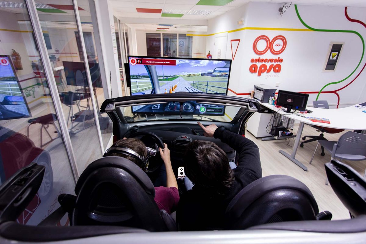
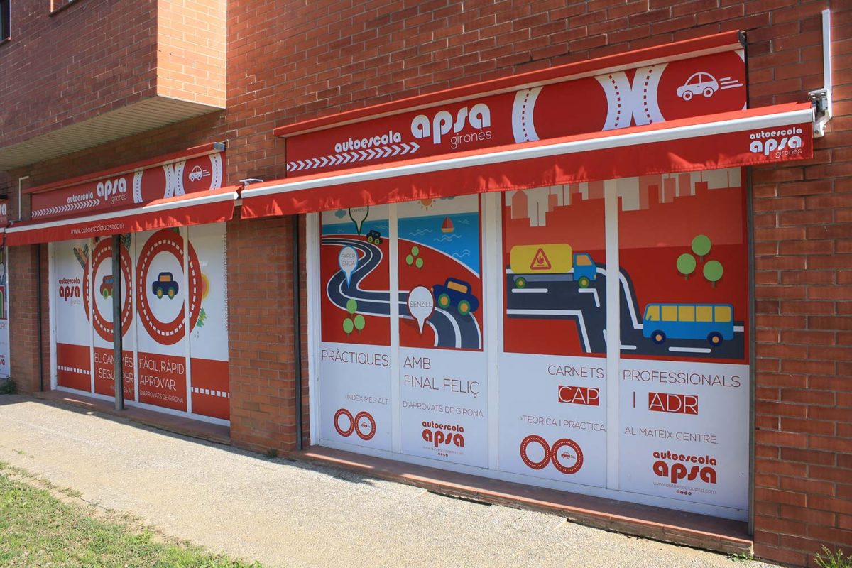
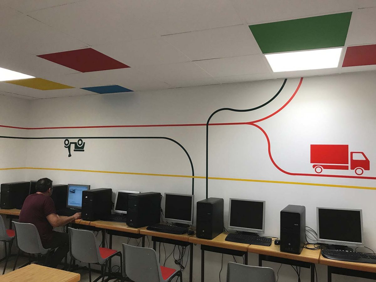
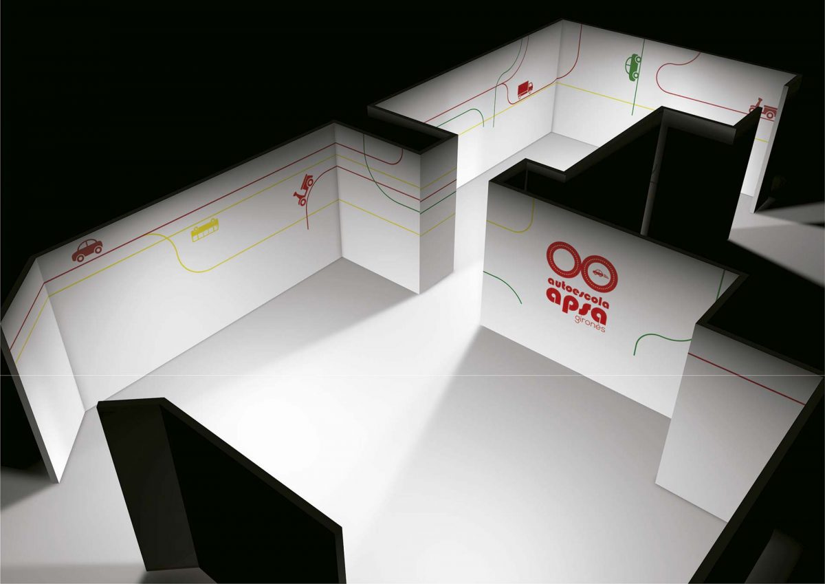
New outdoor and indoor branding for APSA DRIVING SCHOOL
Today the AUTO ESCOLA APSA project is considered an exemplary for many businesses in Girona and Barcelona.
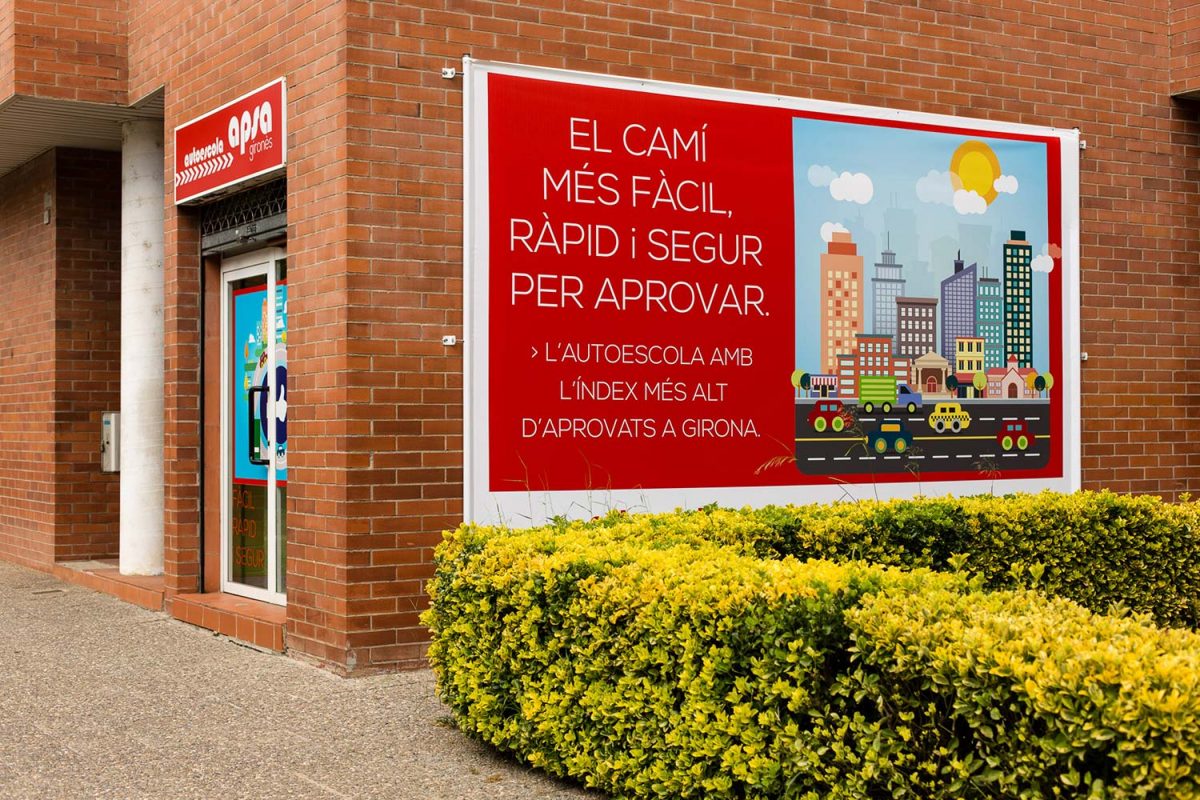
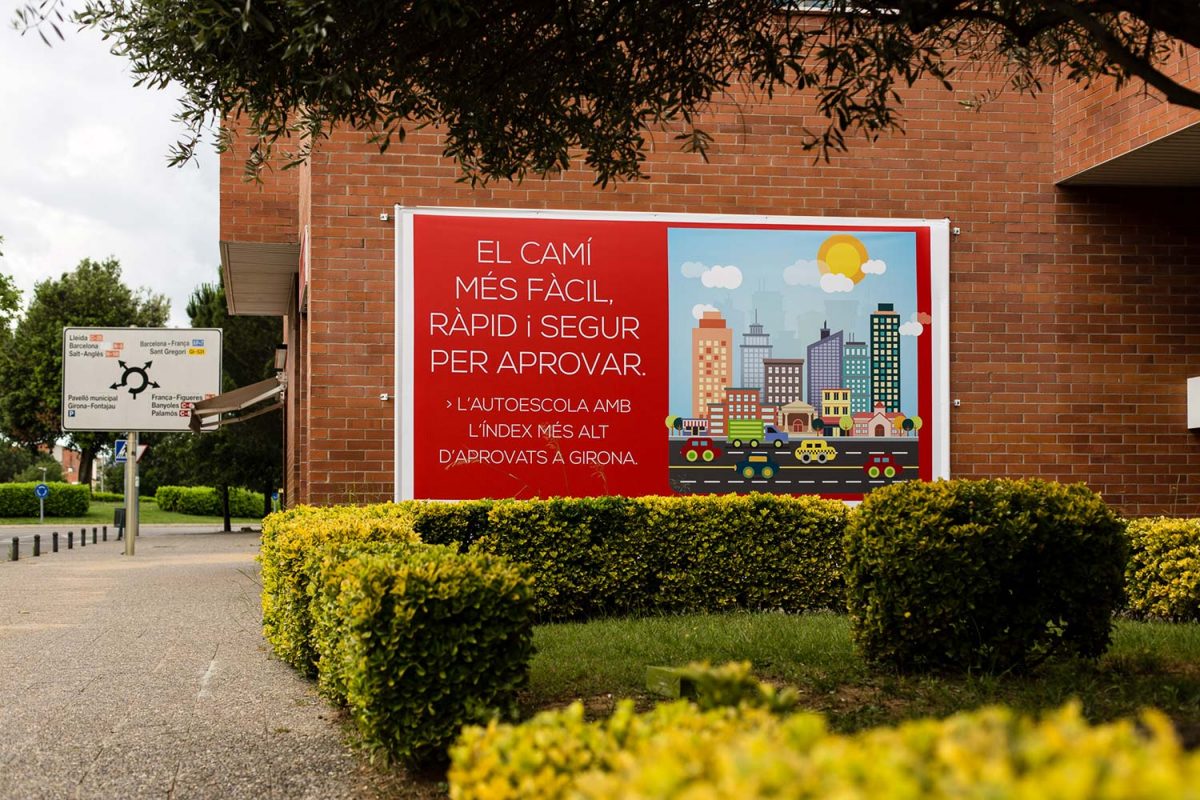
ASPA wanted a fresh image for their logo. We spent time analyzing their current image and their market. Using a framework of the communication, we created a new and restyled logo.
We went back to basics with the color red, and to the not so basic, FERRARI flag. We chose a rounded typeface that has a strong graphic force and set it apart by reinforcing the passion of their customers. The 4 wheels, 2 wheels, or 8 wheels were all that was needed.
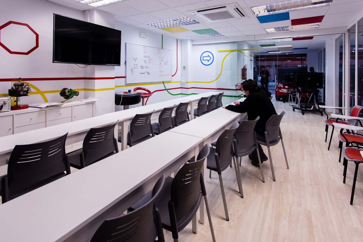
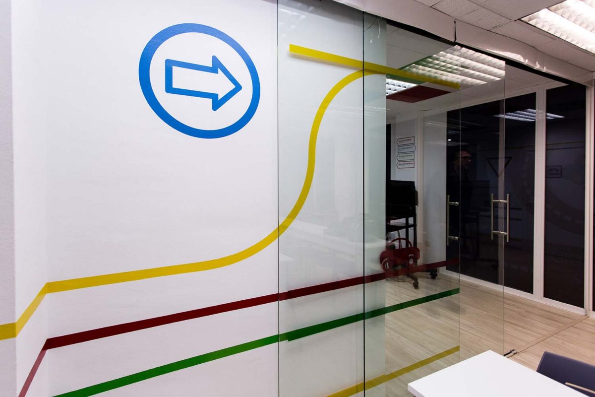
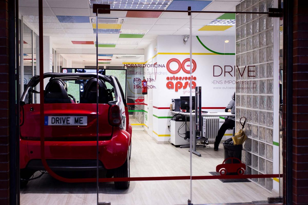
Instead of stopping there, we continued defining the graphic lines to differentiate our work from the competition. We have created the name APSA with an explosion of basic colors, rounded shapes and a new look that represents their pedagogy all with one image.

Back to portfolio


 Exclusive member of